 |
| Marcus Scarman, having a really bad day at work. |
Sunday, July 15, 2018
Sketch Of The Day: The Unlucky Egyptologist
Just a quickie sketch to keep me from getting too rusty. And yes, that would be prolific English actor Bernard Archard. He was a staple of UK film and TV over five decades, appearing in a huge variety of fare, including Danger Man, The Avengers, Z Cars, Horror of Frankenstein, Paul Temple, Sky, Dad's Army, Upstairs Downstairs, Day of the Jackal, Rumpole, The Professionals, Krull, Bergerac, and memorably, 1975's classic Doctor Who serial, The Pyramids of Mars. This is Archard in character as Marcus Scarman - making a very unfortunate discovery in an ancient Egyptian tomb...
Tuesday, May 29, 2018
Beer Is The Path To The Dark Side.
Is it really 5 years since I last blogged? Time certainly gets away. Last week makes 41 years since the first Star Wars film was released, and it definitely doesn't seem that long to me. When it was new I think we saw it at the cinema 9 times. In those days cinemas would buy a print of their biggest earners and run them for literally years on end. Crocodile Dundee screened for so long at our local independent, they had a gigantic painting of Hogan and Kozlowski applied to the side of their building. Rings a bell its season ran for 3 years. When Star Wars came out I was only 3 years old, so seeing it regularly with my sisters possibly counted as big-screen child-minding as much as it attested fandom. Now, of course, Star Wars is a Disney juggernaut, pumping out new films just about every year for better or worse. (For mine, most assuredly worse in the case of a fully CG, horrifyingly Uncanny Valley Peter Cushing - and I'd hoped Blood Beast Terror would be the greatest indignity to befall him.) But the nostalgia lives on - and I still have considerable affection for those first couple of films. (It started to fade a little when the Ewoks showed up.) For the last few years I've been making beer labels for an old friend who runs a bar called The Catfish, in Fitzroy. Special short-runs of beer have been produced to mark each of the fine establishment's birthdays, with illustrations for every brew helping to mark the occasion. The bewhiskered fish itself always makes an appearance in the artworks, thrown into whichever situation the particular style of beer demands. For the most recent anniversary, The Catfish worked with Cavalier Brewing to produce an Imperial Pilsner. And what self-respecting publican Star Wars fan could resist having a beer with a name like that do anything but go to The Dark Side? So it came to pass that a Catfish Emperor ruled over an effervescent amber galaxy - not so long ago, in a bar not far away.
Give in. Let it flow through you. USE THE SAUCE, LUKE!
This was a really fun picture to make.
 |
| The Cavalier Catfish Imperial Pilsner strikes back. |
Thursday, September 5, 2013
Findings Of The Arsegravy Historical Society.
A couple of months ago I was in my hometown, two thousand or so miles north in Queensland. The humidity up there is the kiss of death on anything made of paper, leaching out all the acids & setting in with rot faster than a Poppy Z Brite story. There's also a legion of tropical creepy crawlies sprung straight out of Temple of Doom who are always hungry for a tasty fix of illustration board or acrylic paint. With that in mind I figured it was time to do some preservation work. So I cleared away the cobwebs, vacuumed up the inches of daddy long legs shit and had a rummage through my old art cupboard. After a while spent dusting and washing away the fungus, it was nice to see a few salvageable bits & pieces floating to the top. Some of them went right back to high school, in the late 80's - surprising given that voracious climate. Here's a bunch I thought were just about worth sharing.

This would've been Year 9 or 10 of high school. I remember regularly trying to shoehorn art into subjects that had no real requirement for it - in English it'd be making a book cover to go with a review, in history spending far too much time on a political cartoon, or in a variety of other classes designing the "title page" (marking the beginning of a new unit of study) would maybe get a little more of my concentration than it should've. I actually did enjoy Biology.. but perhaps not quite as much as drawing a guy with a cross sectioned head.
Growing up I was obsessed with the long-running English TV show "Doctor Who". I'm not sure why I fastened onto it so firmly.. although the combination of its instant-satisfaction gothic pulpiness and the ABC's decade-long policy of hypnotic non-stop reruns probably contributed. I suppose most people have obsessive interests of one kind or another - football, music, cars, shoes, Star Wars.. whatever. This was mine. And it provided an endless supply of exactly what I was always after - subjects to draw.


These little pictures were cassette tape covers, about 10 by 6 centimetres in size. Now I look at them and envy the undiminished eyesight that allowed such tiny work unassisted! This was unintentional good training for an illustrator - making them taught me about concentrating on portions & shapes rather than the image as a whole, as well as layout, colour blending and how interesting it can be to draw with the reference upside down for greater objectivity.. Oh, and the cassette format came as a result of two things - our family's lack of a VCR in the early 80's, and the ABC's simulcasting of television audio on the FM band in regional Queensland. I often tape-recorded TV shows and listened back to them like audiobooks. Friends did this too. As an odd dividend I can occasionally remember large chunks of old-TV dialogue! Certainly feels a long way from the everything-on-demand digital world we're all in now..
There was also a bit of figure sculpting that came as a result of the enthusiasm for Dr Who. I would've been 16 when making this Patrick Troughton.. He'd be about 10 or 12 cm tall. I remember slaving to keep detail while the Modeline synthetic baking clay kept either squashing or crumbling. He's a little chunky, but I think he holds up OK. And photographing him up close really made me want to get back to doing some sculpting..

Now here's a few from Uni days. I did a Bachelor of Visual Arts at James Cook University, with an Illustration major. Recently I learned that Visual Arts studies at JCU, while operating out of a lovely new building, no longer include painting or sculpture. Another victim of "rationalisation" and the market-driven reforms at Australian universities in the last 20 years. I'm doubtful that broad, high-quality education is the winner.

This Gregory Peck was one of a few first-year projects designed to test our ability to reproduce faithfully from a photographic source. This one was a bit too hurried, and I ran out of time to finesse the little details.. A good lesson.

My acrylic and coloured pencil stab at Flagg's stony-faced Uncle Sam. Part of a series of six, metamorphosing from the statue of liberty. Not the greatest, but it was a good chance to - tentatively - test out mixing pencils and airbrush, for the background.

It was 1991, I was 18, and Terminator 2 was everywhere. To the present day me, T2 looks like a loud marketing exercise with fun special effects and some remarkably poor dialogue. To the 1991 me, it was irresistible. This picture was still a lesson - not so much in the fun to be had making an image out of dotting with a Rotring pen (arrg!) - but in not improvising details on the fly. The original photo had been taken from a paused video on our convex-screened cathode tube, and the mechanical details were hazy. I didn't work out an approach to dealing with this in advance, and by improvising as I went, those areas just ended up looking fake. Planning helps.

In 2006 McDonalds were still clearing rainforest in the Amazon to plant soya. I have no idea if they're still up to it, but I don't imagine I'm going to warm to them anytime soon regardless. This was still 1991, and the brief was to make a poster addressing environmental concerns using no more than 3 words to convey it's message. It's a mixed media combo of coloured pencil, airbrushed acrylic and crayons. The Crayolas were used for the soil and plants. It seemed like a good idea at the time. Despite that choice, and some figure-ratio & layout problems (he's on a hill OK?), I'm fond of this one.. Maybe it's the killer clown angle. Or maybe it's just fun to throw poo at a really rubbish company.

On this one the brief was a dummy magazine cover. Silence of the Lambs was a big, disturbing hit at the time, and I jumped at the chance to paint Hopkins wonderfully rumpled face. For the retro-airbrushing fans out there I was using a Paasche VL. Still occasionally use it to this day - really versatile piece of kit, (double action, suction-feed for faster colour switching & capable of very fine lines) and a much simpler, easier to use design than the Badger I recently tried. This was my first attempt at using a lot of hand-held masking to make an airbrushed image, and it probably suffers a bit on close inspection. But I'm still happy with the overall effect - and if the writing looks ever-so-slightly wonky, it's because it was all hand-cut masking, just a scalpel and frisket film. Must've taken ages. I think I've blocked out the trauma.

The madwoman was a last-minute (overnight!) job for our graduation exhibition guide in 93. Solidly into the airbrush years by now, I was experimenting with a spatter-effect, achieved by scratching the inside of an old Paasche tip with a compass to make it spit paint instead of atomise. This did make it prone to accumulating large drops of paint every so often, but regular daps with a cloth meant illustration disaster could be avoided. Just like Trust Your Doctor, she's a combination of loose masking cut from acetate & placed on the surface, and hand-held masks, kept away from the surface to soften the lines. It's a very simple piece, but I still think it was reasonably effective.

Yep, it was the 90's. Clapton was enjoying his resurgent fame as a result of the Unplugged album. I did like it, and yes, I do apologise. In my defence, I could at least tell - even then - that Tears In Heaven was a truly horrible song. Let's pretend I did it as a dedication to his work with the Yardbirds, Bluesbreakers or Cream and move on.. This was a third year exercise - another test of observation & use of materials - requiring an illustration as similar as possible to it's photographic source. The original photo is by Albert Watson, and I loved it's dramatic light. The surface is a nice smooth Illustration Board and it was painted with a triple 0 brush using Winsor & Newton gouache. I wasn't a huge fan of gouache, but those were the rules for this project - and I wanted to skip the airbrush on this one, just to make sure I could still blend paint by hand! It probably took about 6 weeks on & off - looking at something that closely needed decent breaks for other work. A strange piece this one - I'm very pleased with it's technical side, but I've never felt the urge to hang it. The curse of this exercise is, if successful, you end with an exact copy of someone else's work.

To finish, one last bit of pop-pulp. I was really enjoying Anthony Hopkins face at this time. By 93 he'd been in Coppola's messy, operatic Dracula, doing his entertainingly hammy Van Helsing. He was almost enough to make you forget the travesty of Keanu & Winona. Almost. The frame was salvaged from a building site by my Dad - once the bottom right corner was restored with a bit of the same synthetic baking clay Patrick Troughton was made of, it was good to go. He was painted almost continuously over two and a half days, oil on canvas. I hadn't blended with oils before & couldn't get the effect I wanted quickly enough - the brushes were ditched and out of desperation I dipped cotton balls in the paint to get it the way I'd pictured. Used with the same kind of hand-held acetate masking I'd tried on the madwoman, it came up fine. Doesn't bear intense scrutiny - the stubble's a bit dodgy, as is the cravat/scarf thing - but for a two day quicky, I think he's fun.
That's all for the Arsegravy Ancient History Show N Tell. I do hope you've enjoyed checking out what was under the cobwebs and spider scat. I guess I should also do an update for the Wildlife Art years that came after today's selection - but that's a horror for another day.
Thursday, August 29, 2013
Electile Dysfunction.
It's election time again in Australia and it's not pretty. Not for anyone with even vaguely progressive politics. Much like the UK and US, there are two major parties cornering the vote. One of them is pro free-trade, pro uranium exports, aggressively opposed to asylum-seekers arriving by boat, substantially responsible for the transition of tertiary education to a user-pays profit-making endeavour (and all for the expansion of programmes charging foreign students up-front fees to boost those profits), pushing to extend the powers of our spy agency ASIO, unchallenging of the monarchy, unquestioningly supportive of the US-style War On Drugs, keen to greatly expand the US military presence in northern Australia and unwilling to remove the recitation of the Lord's Prayer from the opening of parliamentary sittings in a secular state.
Their opponents are the conservative party.
And that conservative party - somewhat deceptively titled the Liberal Party - believes in all of the above, only more so, plus a wide range of environmentally destructive measures (cutting that pesky "green tape"), Trickle-Down Reaganomics, vilification of the gay population, demonising of indigenous Australians, the victimising of any unemployed seeking state assistance, workplace "flexibility" facilitating the poor treatment & easy disposal of unwanted employees and a massive prioritising of road projects over public transport. Oh, and they've got an itchy trigger-finger for public broadcasting. In short it represents rule by business for business. Really old school, short-sighted, two-fisted, big dirty business.
The presence of a host of smaller parties on the political scene seems mostly not to register with the electorate. This may be a product of the coverage given to them by our media. There isn't any. Meanwhile, the years of spin over substance in election campaigning have spilled into day-to-day politics - scant detail, a mantra of simple slogans or generalisations and high-visibility photo ops are the order of every day. Voter disengagement is widespread, and the barely distinguishable large parties now focus their concentration intensely on a handful of marginal electorates, obeying the "wisdom" of daily opinion polls and focus groups in reshaping policy, regardless of how far from their original ideals this process wrenches them. Whatever it takes to please the mighty marginals.
So if you do stick with the big boys it's become a choice between centre-right and far-right. At the moment the omnipresent polls are frowning on the Labor Party's grey, bureaucratic Kevin Rudd, and predicting a win for Liberal leader Tony Abbott, a conservative Catholic monarchist pugelist with a dubious reputation for his treatment of women and taste in swimwear.
It's a depressing prospect. Even attempting to follow the detail can be grinding. So it was nice to get a smile yesterday, even a wry one, from discovering this piece of street art in the city, which summed up my feelings perfectly.
 |
| Finger lickin quality from artist Sitt Sitlakone. |
Thursday, August 22, 2013
Raiders Of A Lost Art.
When I was growing up, the movies made me want to make pictures. Not moving pictures. Posters. Just like the ones outside the cinema. All that lurid hyperbole was irresistible - often I just wanted to stand & examine the detail when friends were rushing inside. There was something really exciting about seeing the stylisation & flourish of the artist, knowing a person had drawn this. At that time the hand-illustrated movie poster was still widespread, with artists like Drew Struzan and Richard Amsel in high demand. They were easily able to lure my young self through the doors on the strength of their deluxe craftsmanship, even when the film was absolutely terrible - I remember happily queueing for my ticket to "Jewel of the Nile" (the justifiably unloved sequel to "Romancing The Stone"), in large part thanks to the giant Struzan poster in the lobby. In years that followed I also came to appreciate the previous generation of poster artists, like Saul Bass, Frank McCarthy, Bill Gold, Luigi Martinati and Robert McGinnis, to name a few.
That made it all the more disappointing when, in the years I was doing my Visual Arts degree, the rush of enthusiasm for the new tool of Photoshop led to a massive downturn in demand for traditionally illustrated posters. But it wasn't just the available tools that had changed - a reorganisation of the film business generally was underway, and the accountants were taking over. This was the beginning of the time when studio contracts would prevent any directorial involvement in cutting trailers. Classically these would be 1 to 2 minutes of sizzle - mellifluous narration (snappily written if you were lucky), a few choice moments to hook you in (or maybe something filmed specially), title, rating, done. Check out the original Alien trailer for a terrifically creepy, suspenseful tease. Once the focus-groups, PR guys and bean-counters had taken over it became very hard to see one without being shown the entire film. The plodding artlessness of this approach is hard to overstate. And the same dull mentality was at work on the posters, leeching the fun, personality - and most importantly the risk - out of everything. This period also saw an upswing in "foreign territories" like Australia not having access to the originally provided artwork. So even when something interesting did slip through, it was often replaced here by whatever could be cobbled together at short notice. Comparing the US-release poster for Soderburgh's "Out Of Sight" with it's Australian version makes a good example. The former is a beautiful retro-70's piece, giving you a strong indication of the film's mood & style. The latter is an indifferent still photo of the stars with a stock image of a revolver 'shopped in. Dispiriting.
But here's something of a happy ending. While the trailer situation may still be a giant black hole of suck, in the last 10 years huge leaps forward in digital design have coincided with a levelling-out of the hysterical pursuit of The New Tool To The Exclusion Of All Else. The dovetailing of traditional techniques with increasingly precise, speedy software is leading to a kind of a renaissance in great-looking, well-thought through mass-produced art. Comic books, rock band posters and even the occasional movie are enjoying the benefits. Lots of the resurgent film art is coming from the online world rather than the studios. Companies like Mondo and Phantom City Creative, along with countless individual artists are making movie-related images that are actually nice to look at. Maybe there's hope for illustrators yet.
Here's a few examples of the tiptop stuff floating around out there from the horror(ish) genre alone:
And one last - from a past master, drawn out of retirement by the good folk of Mondo on the promise of an open brief to make a poster for any film he chose...
That made it all the more disappointing when, in the years I was doing my Visual Arts degree, the rush of enthusiasm for the new tool of Photoshop led to a massive downturn in demand for traditionally illustrated posters. But it wasn't just the available tools that had changed - a reorganisation of the film business generally was underway, and the accountants were taking over. This was the beginning of the time when studio contracts would prevent any directorial involvement in cutting trailers. Classically these would be 1 to 2 minutes of sizzle - mellifluous narration (snappily written if you were lucky), a few choice moments to hook you in (or maybe something filmed specially), title, rating, done. Check out the original Alien trailer for a terrifically creepy, suspenseful tease. Once the focus-groups, PR guys and bean-counters had taken over it became very hard to see one without being shown the entire film. The plodding artlessness of this approach is hard to overstate. And the same dull mentality was at work on the posters, leeching the fun, personality - and most importantly the risk - out of everything. This period also saw an upswing in "foreign territories" like Australia not having access to the originally provided artwork. So even when something interesting did slip through, it was often replaced here by whatever could be cobbled together at short notice. Comparing the US-release poster for Soderburgh's "Out Of Sight" with it's Australian version makes a good example. The former is a beautiful retro-70's piece, giving you a strong indication of the film's mood & style. The latter is an indifferent still photo of the stars with a stock image of a revolver 'shopped in. Dispiriting.
But here's something of a happy ending. While the trailer situation may still be a giant black hole of suck, in the last 10 years huge leaps forward in digital design have coincided with a levelling-out of the hysterical pursuit of The New Tool To The Exclusion Of All Else. The dovetailing of traditional techniques with increasingly precise, speedy software is leading to a kind of a renaissance in great-looking, well-thought through mass-produced art. Comic books, rock band posters and even the occasional movie are enjoying the benefits. Lots of the resurgent film art is coming from the online world rather than the studios. Companies like Mondo and Phantom City Creative, along with countless individual artists are making movie-related images that are actually nice to look at. Maybe there's hope for illustrators yet.
Here's a few examples of the tiptop stuff floating around out there from the horror(ish) genre alone:
 |
| Phantom City Creative |
 |
| By Martin Ansin, for Mondo. |
 |
| By Matt Needle |
 |
| By Brian Churilla |
 |
| By Adam Rabalais |
| By Dirty Great Pixels |
 |
| By Phantom City Creative (Andromeda Strain) |
 |
| By Kevin Tong, for Mondo. |
 |
| By Martin Ansin, for Mondo. |
 |
| By Daniel Danger, for Mondo. |
And one last - from a past master, drawn out of retirement by the good folk of Mondo on the promise of an open brief to make a poster for any film he chose...
 |
| By Drew Struzan, for Mondo. |
Sunday, August 11, 2013
Aliens Ate My Desk Set!
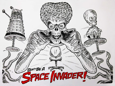
The library I work at can get pretty jam-packed at times. For a while they'd been noticing people leaving a few possessions on the jelly-bean desks in the morning to "reserve" them, and having planted the flag, wandering off for a good chunk of the day. With demand for space high, they wanted to get the message out that the resources needed to be shared. I was asked to draw something up on an A0 sized whiteboard - something eye-catching so as to get punters over & reading the fine print, and not too officious or tut-tutty. The tagline was "Don't Be A Space Invader", which left it pleasingly open to drawing some familiar big-brains, bug-eyes and killer 'bots. Here's the finished product.

Thursday, August 8, 2013
It's Scribblin' Time!
Here's a few more examples of the library quicky-cartoons I mentioned in the last entry. Perfection isn't the goal with these - usually it's just to draw something silly and keep my hand in. Drawing something - anything - every day really does help with shaping ideas and keeping and your skills up. Also it's fun, so why not? Some are scribbles left on the slips of paper meant to indicate which library campus a box of books is headed for, while others have been left on lonely whiteboards, abandoned in the digital scramble. An empty whiteboard is surely a terrible thing to waste.
Most of these date back to the time when we had a whole campus reserved for business-related studies. It's the reason we have books in the collection with titles like "Be Know Do", "Power Mentoring!", the touching "HR From The Heart" and most ludicrously, "Sun Tsu's Art of War for the Sales Warrior". To express a low opinion of the entire "business community" might appear to be a terrible sweeping generalisation - if "business" is taken to cover everything from the local fruiterer & bookstore, to film-making, music, restaurants and my very own illustration services inclusive. So just to be clear I'm not insulting everybody in the world here - the "business community" I'm talking about is everybody's favourite old cliche-because-it's-true Big Business, and it's commonly accompanying philosophy of the ethical vacuum, Whatever It Takes. In Australia I'm thinking of the Chambers Of Commerce, the Minerals Council, the Murdochs, the Packers, Gina Rinehart, Andrew Forrest, Clive Palmer and well-paid industry PR hacks like the Institute of Public Affairs. The kind of people who refer to laws designed to protect the environment as "green tape" and keep the details of bent multi-billion dollar Public Private Partnerships a secret on the basis of Commercial In Confidence clauses. I'm also thinking of their army of facilitators, like the plethora of giant commercial consultancies, nourished partly as a consequence of 30 or more years of hamstrung "rationalised" universities desperate for funding & retooled as for-profit enterprises pumping out management graduates without specific expertise in the industries they go on be paid like gods to be Executive Officers of and, not aware of or believing in the resource of knowledge & experience to be found within the organisations they run (and always keen to ensure buffers for later blame-shifting), calling in expensive, unnecessary external advisors. Basically an anti-egalitarian distillation of self-regard, bad faith, incompetence and corruption. As John C. Hall of King Missile would say, oh, don't get me started. Which reminds me of something else he said - "Life is hard, brutal, capricious and unfair. Sometimes there is a benefit to seeing it clearly and acknowledging it truthfully... and other times it is best to find something to laugh about, lest despair crush one completely." Here's some scribbles.


Most of these date back to the time when we had a whole campus reserved for business-related studies. It's the reason we have books in the collection with titles like "Be Know Do", "Power Mentoring!", the touching "HR From The Heart" and most ludicrously, "Sun Tsu's Art of War for the Sales Warrior". To express a low opinion of the entire "business community" might appear to be a terrible sweeping generalisation - if "business" is taken to cover everything from the local fruiterer & bookstore, to film-making, music, restaurants and my very own illustration services inclusive. So just to be clear I'm not insulting everybody in the world here - the "business community" I'm talking about is everybody's favourite old cliche-because-it's-true Big Business, and it's commonly accompanying philosophy of the ethical vacuum, Whatever It Takes. In Australia I'm thinking of the Chambers Of Commerce, the Minerals Council, the Murdochs, the Packers, Gina Rinehart, Andrew Forrest, Clive Palmer and well-paid industry PR hacks like the Institute of Public Affairs. The kind of people who refer to laws designed to protect the environment as "green tape" and keep the details of bent multi-billion dollar Public Private Partnerships a secret on the basis of Commercial In Confidence clauses. I'm also thinking of their army of facilitators, like the plethora of giant commercial consultancies, nourished partly as a consequence of 30 or more years of hamstrung "rationalised" universities desperate for funding & retooled as for-profit enterprises pumping out management graduates without specific expertise in the industries they go on be paid like gods to be Executive Officers of and, not aware of or believing in the resource of knowledge & experience to be found within the organisations they run (and always keen to ensure buffers for later blame-shifting), calling in expensive, unnecessary external advisors. Basically an anti-egalitarian distillation of self-regard, bad faith, incompetence and corruption. As John C. Hall of King Missile would say, oh, don't get me started. Which reminds me of something else he said - "Life is hard, brutal, capricious and unfair. Sometimes there is a benefit to seeing it clearly and acknowledging it truthfully... and other times it is best to find something to laugh about, lest despair crush one completely." Here's some scribbles.


Subscribe to:
Posts (Atom)